Upping your game: How to keep improving as a type designer.

This article is aimed at type designers who are in the blossoming period of their career – somewhere between beginner and intermediate. This can be an exciting time where you have maybe produced a dozen or so different font families, you’ve had some success with sales and the extra income is making life easier, Monotype is promoting your work, people are messaging you to find out more about you and your type portfolio, etc. But there’s a nagging feeling that you need to up your skills to get to the next level and achieve your goals.
The question is, can you get there under your own steam or should you enrol on a full-time type design course? I chose the former and the following paragraphs of advice are pulled from my own experiences while establishing myself in this wonderful type design world.
Keep making mistakes
The greatest learning experience is to make mistakes and not be afraid to make them. Of course, as you are drawing the greatest ampersand that has ever been created having no peers whatsoever, you will not realise that you made a single mistake. It is imperative that you let your drawing style and technique flourish as you develop as a type designer. The eureka moment comes when you look back at your earlier work and realise that those arcs are not as smooth and balanced as they could be, and the weight is a little light compared to the rest of the typeface, and so on.
Thankfully, over time, as you immerse yourself into the world of creating fonts and become influenced by the GOATs of type design, your perception changes. You can now go back to that misshapen ampersand and correct it. If you can say to yourself “What was I thinking when I drew the ‘g’ like that?”, then you are making excellent progress as a type designer. Why not take a few days to create an improved version 2.0 of that font and release an update for your previous customers? This is highly beneficial when building up your reputation. So keep making those mistakes and return with a critical eye in the future.

Discovering space
I often see descriptions of typefaces where they claim there are something in the region of ‘2500 kerning pairs!’. Seriously, if this is the case for a basic typeface, this is not something you should be boasting about. It is highly likely you have not mastered the art of adjusting side-bearings and spacing your font correctly before attempting the most necessary kerning pairs. You should begin the process by typing out a simple string of letters such as ‘HOHHOOHnonnoon’ and train your eye to look at the negative space between the glyphs. Adjust the side-bearings on each glyph so that they look balanced to you. Now apply those side-bearings to glyphs that share the same vertical characteristics. Type out a word such as ‘minimum’, is that balanced? Does it have a consistent rhythm? You’re well on the way to saving yourself hours of kerning. Once you have the basics nailed, move on to common letter combinations such as ‘st’ and ‘re’. Place them into words and adjust the side-bearings so that kerning is not required. Once you have mastered this, you can try trickier character strings such as ‘AWAYAVATAR’ where you will most likely require kerning adjustments.
While we are still exploring space, do not forget the space character itself! This is an integral part of how well your typeface will read on screen and in print. Again, this is something that will come with experience. There are no set rules as to how wide the space character should be, but if your words are wide enough apart to drive a bus through, then you really need to address this. The space character should be at its widest in your thinnest weight and narrowest for the heaviest weight. You will need to judge the overall balance by eye rather than mathematical calculation.
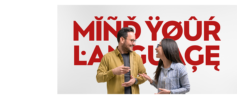
Mind your language
I strongly urge that you invest some time into studying diacritics. You will soon realise that poor application of them can cost you a sale from a European language-speaking customer. The golden rule for diacritics is to have them harmonise with the tittle of the ‘i’ glyph in your font. Don’t be afraid to go a little heavier on the weight too, the important thing is that they are clear and distinctive. Another consideration to add further professionalism to your fonts is to adjust your diacritics for caps. Generally speaking they should sit in a shallower space than their lowercase counterparts, a little bit heavier in weight and wider too.

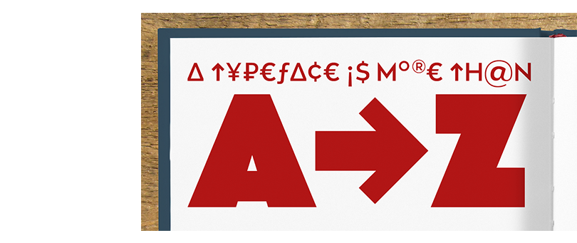
A typeface is more than A to Z
So you have spent weeks developing your wonderful new typeface and every letter looks absolutely gorgeous in your eyes… but wait… what about that sad looking pair of braces sitting in the corner? Every professional type designer will have considered each and every glyph in a new font, ensuring that the same styles and rules are adhered to as set by the main character set from A to Z. All punctuation, symbols and marks should be treated with equal care and attention. You will appreciate the huge difference it makes to the final typeface, and so will your potential customers.

Keep on pushing
I always find that the break between completing and designing a typeface is a great time to down tools and explore something different. Sometimes it is best to take a complete break altogether and get away from screens. However, more often than not, I tend to find myself something type-related to indulge in. I might absorb myself in a particular period of type history, or go travelling and appreciate the local typography, I might go back and tweak an older typeface for an update or challenge myself to learn something new. As I write this article I am incorporating Cyrillic into a typeface for the first time. It’s particularly taxing as I do not understand the language or the context in which these new letterforms I am creating will be used. But I will persevere, and I will get help on areas I might struggle with. The important thing is to keep challenging yourself and your capabilities. It keeps you in a continual state of learning and thus inhibits the possibility of stagnation… and no one wants that.
