Embracing growth: notes on releasing your first font.

Designing your first typeface is a great challenge, but continuing to evolve past it is a moment of freedom and growth. It’s easy to get attached to your first shapes; the first time you see them in text, it’s exhilarating. Having spent over a decade in the industry, I’m excited to take you on a deep dive into my journey, reflect on those early days, and share lessons I’ve learned along the way.
Discovering Type Design
I love drawing and expressing myself through painting and drawing. This path led to architecture, which has influenced my work as a type designer by paying attention to detail and respecting typography history. Typography and type design weren’t my initial pursuits; architecture was my first study. However, my passion for the arts and attention to detail drew me toward type design.
After working briefly as an architect, I returned to school to study graphic design and typography at Escola Superior Artes e Design of Matosinhos in Portugal. I had a revelation when I attended classes by Dino dos Santos on typeface design. I fell in love with it and tried to learn all I could for the next two years before applying to Reading, UK, to study type design. I managed to get into the course, and it was a joyful moment when I received the acceptance letter.
Publishing My First Typeface
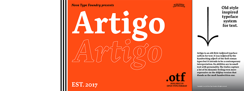
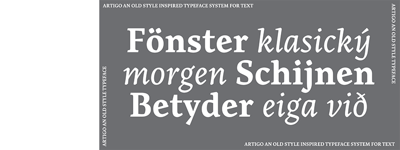
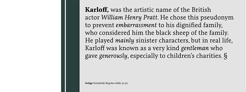
My first typeface, Artigo, was designed in Reading and was a labor of love that took years to complete. It was a learning process to design it. It was an iterative process that included mentorship and feedback to get it to a moment ready to be released to the world. Despite the strength of its design concept, I grappled with a persistent sense of incompleteness. Balancing the demands of commissioned work and teaching added complexity, making it challenging to find dedicated time for this personal project. The process helped me fight perfectionism’s goal and replace it with feeling good enough.
The release of Artigo marked a significant milestone, albeit one tempered by uncertainty. In an industry characterized by perfectionism, I wrestled with the notion that my creation might never meet the elusive standard of flawlessness. However, through iterative refinement and unwavering determination, I learned to embrace its imperfections as part of its unique character. Gradually, Artigo evolved into a testament to resilience and growth, a tangible representation of my journey as a designer.
However, with time and mentorship, I overcame my insecurities and fear of judgment, eventually releasing Artigo and working on the following projects like Quando with newfound confidence.
After graduation in 2010, I got my first gig designing a Google Font. Quando was my first font from scratch and outside of the academic world. I created it with the mentorship of Eben Sorkin, a fantastic type designer. This typeface took almost six months to get one weight done! I learned that resilience and patience were crucial in embracing the design process of a typeface in the first years of my career.
Overcoming Insecurity and Perfectionism in the Industry
My insecurity and fear of being judged by my peers kept me from publishing my first typeface earlier. I felt like an imposter and waited too long to share, Artigo. Time and experience helped me overcome this feeling, and repeating the process of designing a font became my journey to a more relaxed approach to the work. Also, getting positive feedback on my earlier typefaces kept me going for the next one, and I continue to be curious and design new shapes.
I first published my typeface around 2015, so it took around four years to gain the confidence and security that good enough is good enough. Perfectionism had the consequence of keeping the typeface too long in the drawer instead of sharing it. There was a risk that it could become dated and irrelevant.
A few years later, with more practice, I found ways to overcome this block, and at the same time, slowly, the industry changed.
One thing that helped to overcome my insecurities was looking into the 2000s and what happened with the now-established type of designers advocating for perfection. They created digital fonts in the 2000s, using experimental, ugly, grid, and other fonts. They used the MyFonts platform to test different ideas and see what clients were interested in. They used it as their playground, which inspired me to move in a different direction.
Exploring new ideas more quickly has become a regular part of the industry, and many type foundries now have lab/experimental fonts to play with shapes and explore creativity beyond commercial fonts.
Making Room to Play with Changing Technology
I started to think that done is better than perfect and tried out releasing unfinished fonts. This process helped me avoid the creator’s block and feel free to play with type, making the process lighter and more fun. For my latest experiment, Baga, a script fluid typeface, I started to think of what I would like to see in tasty cookie packaging. I created one weight only to test the idea. I enjoy experimenting with new concepts quickly and seeing how they will grow.

When I started improving my technical skills, I was using Font Lab 5, which was hard to begin with, even though I always felt at home because it reminded me of AutoCad drawing for architecture. Still, it demanded a lot of learning from you at first before you felt at ease. Font production remained a mystery; you had to do a deep dive. I finished many typefaces with FontLab 5, like the Devanagari font Karma on Google Fonts.
When Glyphs appeared, I was an early adopter; it felt much more intuitive and comfortable. It also made font production more accessible for the everyday designer. In the early years, it allowed me to operate as a one-person foundry. Things have then evolved to a bit more complex with Variable fonts and specifications, but Glyphs still greatly supports independent foundries. This software changes also made me feel less like an imposter and able to operate better and finish fonts independently.
Glyphs also allow ideas to be tested much quicker in the digital format, allowing for more experimentation without spending much time.
When You Learn to Let Go, You Embrace Growth
Quality should be the primary concern when designing a new typeface, not perfectionism. The latter holds us back from exchanging ideas, sharing our work, and growing. We need to fail often to create something people will care about. Each typeface taught me something new, and with them, the foundry grows.
Looking at my library of fonts, I can see the challenges and struggles behind them; they tell a story about my path. If you ask me what my favorite font is, I will answer you: it is the last one because it shows I am getting better and sharper, and my work is becoming more compelling. As for the next typeface, I need to finish it and send it to the world to use when it’s good enough, not wait until it is perfect.
