How to make great artwork for fonts.
One of the most enjoyable aspects of being a type designer is reaching the point where you get to play with your brand new typeface and create some engaging promotional graphics. This is your chance to show the world just how stylish, intricate, and versatile your fonts can be. First impressions count, and, in a highly competitive arena, having impactful imagery is perhaps your best chance to persuade potential customers from perceiving your fonts as a “maybe” to becoming a “must have”.
In this article, I aim to guide you through the process of creating great artwork for your fonts by sharing my own experiences and methods, and why I believe it is worth going the extra mile when creating your promotional graphics.
Work and Play
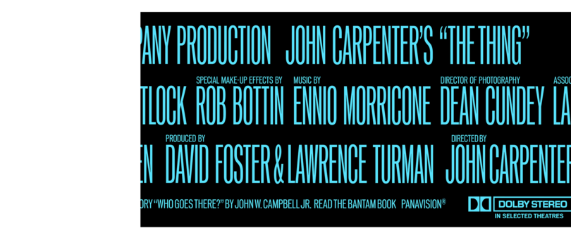
While it may be logical to start creating promotional imagery once your fonts are ready to release, I find I am exploring visual concepts as soon as I have drawn a basic alphabet. This helps to form the typeface in your mind and on screen. You may find practical uses at an early stage which in turn defines a purpose and personality for the fonts. When playing with the embryonic forms in tandem with drawing each glyph and expanding the typeface toward completion, allow your imagination to flow. You can stumble across a new design direction or decide that you need to create additional weights or widths to cover the full potential of your creation. This is what happened to me during the process of creating PG Grotesque. After completing the regular weights, it struck me that a compressed version of the fonts would be perfectly suited for movie poster credits. It would take considerable time to complete this additional work, but the end result was absolutely worth the effort.
The Name Game
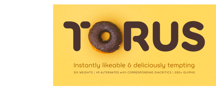
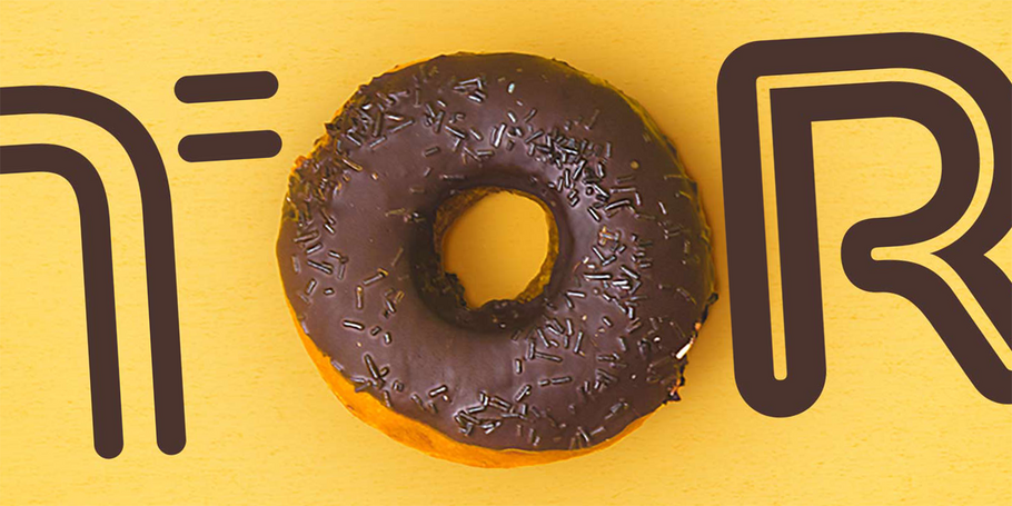
As a type designer/foundry you will have no doubt on numerous occasions conjured the perfect name for your new type family, only to discover that it has already been taken by another foundry in the past. Once you eventually decide on a name for your next release, can that name be used as an integral part of your visual concepts to illustrate the typeface’s personality? This is perhaps the easiest of all methods to begin creating images that will give your fonts a strong voice. It is akin to building a brand for your type family and I have used this approach on numerous occasions with Torus, Cream, and Arise being notable examples.
Unique Characteristics
Naturally, you will want to show off your typeface’s unique characteristics within your array of images. A good way to showcase your craft and attention to detail is to highlight particular elements within certain glyphs that have flair or distinctive attributes. This is when a more technical style of artwork can be most beneficial where those stylish and unique elements are highlighted and annotated.

House Style
Perhaps a long-term consideration for your promotional graphics is to create a “house style”, whereby you set a standard format and colour scheme that can be applied to numerous type releases. This can really help to build your foundry brand and solidify your reputation in the minds of type users – particularly so if you are also creating high quality graphic examples of your fonts in use. Take a look at superb examples of house styles by Hoefler&Co. and Connary Fagen, Inc. for inspiration.
Have Fun!
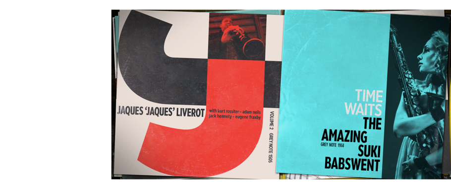
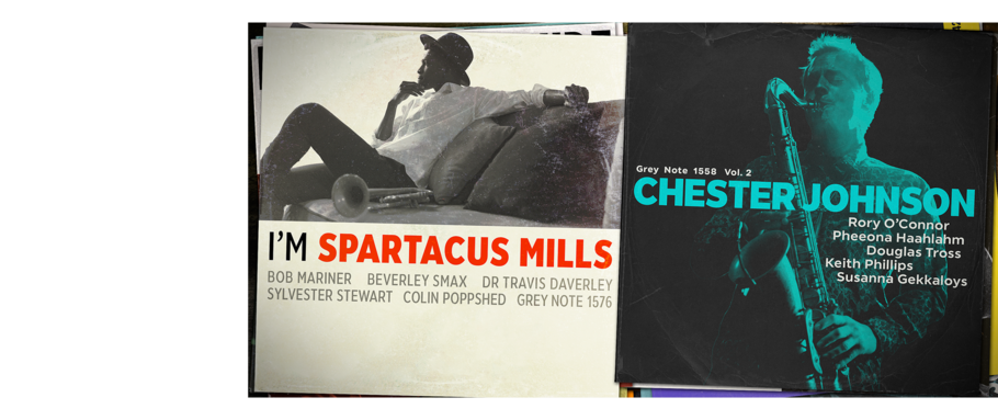
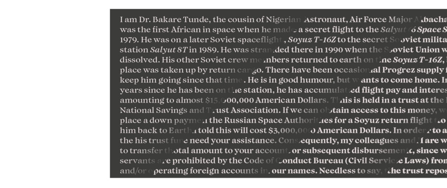
It’s really important to show the joy you had using your own fonts. I believe this is a major contributor to inspiring someone to invest in your typeface. It’s a chance to let your imagination run free and create something based around your interests, products that you are familiar with, or whatever comes to mind. Perhaps you could create a brand for an imaginary health food company? You could have fun showcasing your fonts with the logotype, packaging, advertising, and so on, creating “real world” photographic scenarios for the products or more illustrative examples if that suits your style better. For Modica Pro, I created dozens of record sleeves in the graphic design style of the Blue Note record label that I have long admired and chose the best ones for my promotional graphics. The fonts take prominence in the names of fictitious musicians – unbeknownst to many, all of those names were characters from a favourite TV comedy show of mine. I enjoyed leaving that Easter egg there for other fans of the show to pick up on.
Adding Personality
Whether you are an individual or part of a team, you can add personality to your foundry by showcasing your interests, skills (aside from type design), sense of humour, and much more when promoting fonts. For instance, it may be the easy option to grab a royalty free mockup image of a billboard and insert your typography into that for one of your promotional images. If your interests and skills include fitness and photography, why not combine them to create an advertisement for a gymnasium? What if you took a photo of a billboard local to you and learned how to manipulate that shot by use of smart objects in Photoshop? With a little extra effort, you will have created something unique that is genuine and realistic. Showing that you have put extensive thought and application into producing engaging imagery adds a layer of personality to your foundry brand.

Size Matters
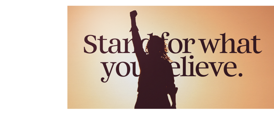
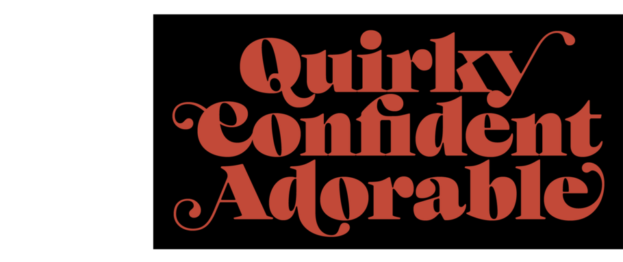
Another important element to consider when highlighting the unique attributes of your new typeface is to portray the scale of your beautiful characters. Whether your font works well in smaller point sizes or much larger, show off the scale and proportions in at least one image. You should consider your words and phrases carefully and try to incorporate glyphs that have a strong personality. Choose the most distinctive characters – especially if they have ligatures, alternates, flourishes, or flamboyant swashes.
Avoiding Pitfalls
All foundries want to portray themselves as professional and offering the best quality typefaces available. However, if your promotional images contain glaring errors or spelling and grammar mistakes, this will most likely have a detrimental effect on the impression of your typeface and foundry. Always, always proofread and have a third party check your imagery before release. If you struggle with the English language, then you might want to consider working with a native speaker to ensure your phrasing, context, and terminology are correct. Alternatively, create typographic images that are in your native language, you will find this will be far more comfortable for you and provides a more authentic result. Also, if you or your foundry team are not confident in the process of creating visual imagery for your fonts, then I would strongly advise liaising with a graphic designer to create professional graphics on your behalf.
Going the Extra Mile
It’s good practice to include several examples of how your typeface works. You have the ability to add up to 15 images – that provides plenty of opportunities to grab the viewer’s attention and potentially get yourself a customer. Ensure that your first three images are the most impactful, with special attention given to your title card – the first image with the name of your typeface. A good mix between practical, technical, inspirational, and real-world images will give your fonts the best chance to be selected by potential customers as well as being chosen by the Monotype marketing team for inclusion in email campaigns, premium website positions, and on various social media channels. The bottom line is that these promotional images are to encourage sales and strengthen your foundry’s brand. For your next release, why not try going the extra mile and see how it affects your income and brand reach?
