Font specimens that sell: Why your font shouldn’t be the star.

Fonts are a peculiar kind of thing to sell. They’re somewhere between a raw material and a work of art—somewhere between a software and a shade of paint. After spending months sketching, drawing letters, tweaking, adding weights, and eventually releasing your typeface, it’s difficult to pin down why someone should buy it. In this article, we will explore one of the best tools at your disposal when trying to sell your typeface: The humble type specimen.
Rather than a historical survey of type specimens and how they have evolved—which sounds very interesting to us type-people—we will approach specimens from the other end. How do users of type (graphic designers, web designers, et al.) use fonts? How do they browse for and pick fonts? What are they looking for?
Most designers aren’t concerned with type specimens, per se. They aren’t entrenched in the history and mythology of type in the same way type designers are. Perhaps they took a typography course in school, and maybe they have their set of favorites, but the typical designer browses afresh for each new project. For them, it’s one of the fun parts of the job, in no small part because the process of picking a typeface remains mysterious to them. So, what are they looking for?
How people shop for fontsNo matter the end product the designer is producing—whether book, app, magazine, webpage, or logotype—most designers today look for inspiration. It’s a term that makes some wince or roll their eyes, especially type designers who spend countless hours in the weeds, far removed from a particular typeface’s original muse. For many designers, though, it’s just a natural part of the process. They make mood boards and favorites folders full of posters, web pages, and brands that jump out at them for a given project. They aren’t even thinking about the type yet. They’re thinking about the overall aesthetic: Colors, layouts, patterns, imagery, and type all rolled up into one bundle. It isn’t until they’ve picked a direction that most designers will consider the constituent parts. At that point, the designer will start to evaluate the features of the typeface they want.
That bears repeating: Most designers will start the font selection process only once they have picked an overall direction and aesthetic for a project.
Look at type from outside typeWhat does that mean for selling your font, then? It means that when a designer goes looking for a typeface, they’re often not looking for a set of formal traits, but rather an aesthetic match. When promoting and presenting your typefaces, you might be tempted to focus on the technical details that stand out to type people; however, the target audience might be interested in seeing something else.
You spent many hours creating your typeface, and you know all the typographic details and why they’re important, but the audience probably doesn’t. Think of buying a car: Unless you’re a car-fanatic, you care far more about the look, the safety rating, the interior space, the comfort of the driver seat, and how well it drives. Aside from the safety information, these are all evaluations you can make by yourself within minutes of getting behind the wheel. The detailed mechanics of how and why the manufacturer was able to achieve those results are of secondary importance.
Designers buying fonts act the same way. It’s the look and feel that matters the most. Then, the language coverage, OpenType features, and other important details are like the safety rating. Some projects prescribe requirements that designers will need to meet, but they won’t pick a font for those features, only eliminate a font for lack of them.
Put simply: The first specimen image a customer should see is one that looks like what they’re designing. It should appeal to their desire to match their already-decided direction.
Knowing what to designNeither can you tell in advance what each designer is working on, nor can you design custom specimen graphics for every potential aesthetic. What you can do, though, is pick one or two use-cases for which your typeface is ideally suited and create or commission high-quality graphics that show it in those use-cases. To start, look back at the original idea behind the typeface. We come full circle, to your inspiration.
Maybe you were inspired by the Chicago World’s Fair. The future of the past looked so bright yet handmade. The aesthetic of the fair mixed vernacular sign painting with the Beaux-Arts style, so your resulting typeface is “timeless” and “cheerful,” bordering on endearing. Who would use such a typeface? While the modern equivalents of the World’s Fair might be too techy to consider it, the food industry would be interested.
Perhaps you love old pattern papers and textiles; maybe you’re taken with the idea of abstracting typographic forms to create new combinations. Ornament typefaces are not the most popular today, which leaves room for your pattern-making font. Who would use such a thing? Sometimes the obvious choice is best.
If you fell in love with Didones but wanted to try your hand at shrugging off some of the history and injecting some contemporary personality, then maybe you would make a high-contrast, modern display typeface. These had their poster heyday, then their editorial renaissance, and now feel right at home in advertising.
If your typeface lacks personality—designed to be a “workhorse” sans serif—then it might be tempting to design a specimen that shows it used in website body text, or something similar. But where else are vanilla neo-grotesques used, which might be more exciting? Warning labels.
Maybe your typeface is an ever-so-slightly fashionable sans serif with a quirk or two you threw in for fun. Well, those quirks are what identity designers want to help their safe client look a little cooler. Heck, that quirk could become the core of their brand design.
Forget the type, focus on the design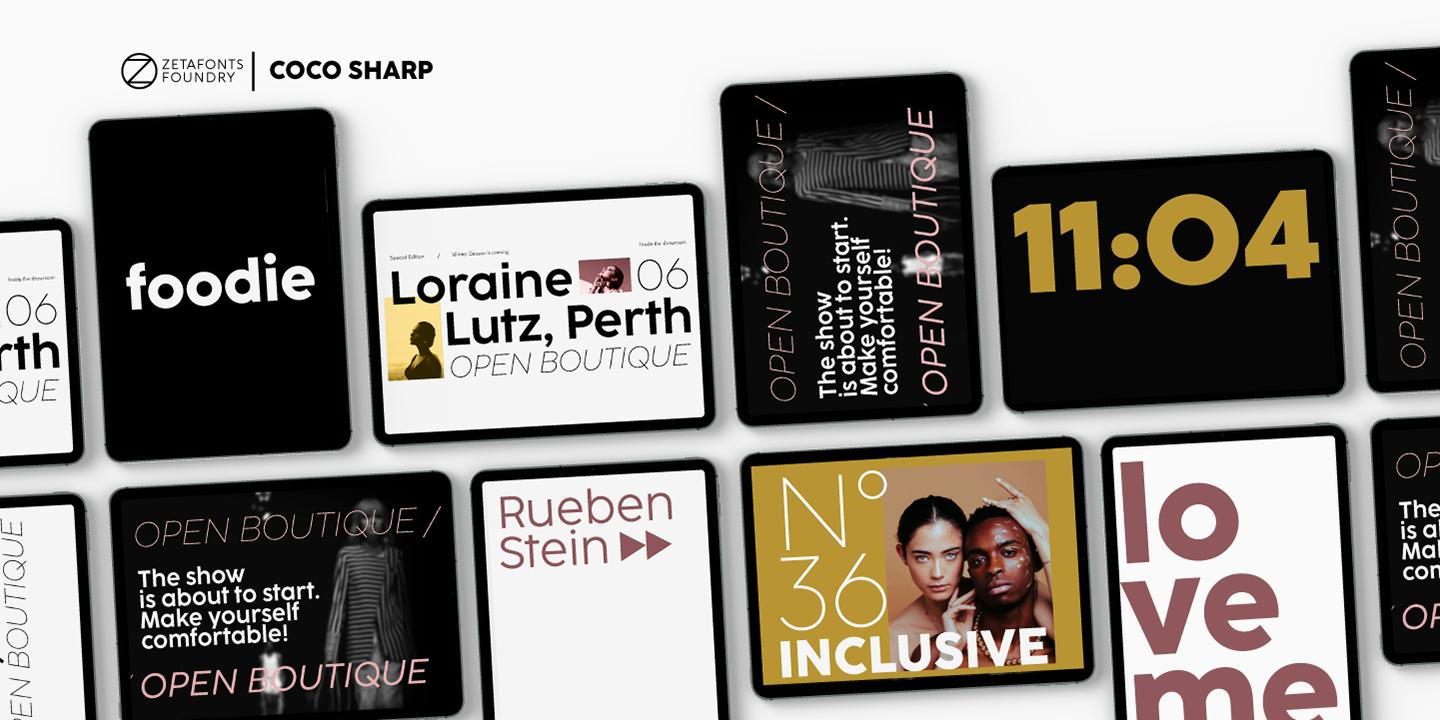
One thing you’ll notice in each of these examples is that the typeface is not the star of the show. You might feel some apprehension relegating the fruits of your labor to a supporting role. That’s natural. It might be difficult to hear that designers don’t care about your font nearly as much as they care about their design, but it’s true. Show your typeface in context—the right context—and designers will see its value. After the first specimen image, feel free to show off all the nitty-gritty technical details you’re so proud of. The first specimen image gets your font on the shortlist, the details help it get selected.
About The Author:

Lucas Czarnecki
Typographer and creative director
Lucas Czarnecki is a typographer with a background in marketing. His agency, Arena, helps type foundries establish themselves with their own websites. He lives in a cabin outside Charlottesville, Virginia, from which he serves as a board member for ATypI and Tuesday Design Society, does letterpress printing, produces the Charlottesville Design Week, and works as Creative Director for Type Network.